We’re Making Some Improvements To Your Proxy Dashboard
We have a confession to make. In the last five years, we’ve been focusing so much on other projects – adding new proxy types to our product line, backend fixes to improve functionality, helping our partners at Rayobyte’s Web Scraping API get their business off the ground – that we’ve neglected some portions of the user experience. And for that, we are truly sorry.
Most notably, well…let’s talk about that dashboard. We’ve received your tickets and we’ve heard the message loud and clear: the current proxy dashboard has got to go.
Today, we’re proud to unveil some preliminary changes to our user interface for proxies. This will be followed, later in 2020, by a full redesign of our proxy dashboard.
Read on for more details!
Making Things Easier
Did you know that the previous toolbar was actually four different menus nested in dropdowns? Probably not. Our new left menu should make things much more obvious.
We’ve also created a new home page that should make it easy for new and old users alike to navigate the complexities of proxy usage. Not sure where to go to upgrade a proxy package? In the previous iteration, you would have had to click the “Manage Subscription” button in the left menu. Now, you can just click the navigation link that says “Upgrade, downgrade, or cancel a proxy package.” We think that’s a lot more intuitive.
Added Functionality
We’ve added some new products since the last major dashboard update, and we wanted those products to be as easy to use as our classic sneaker proxies.
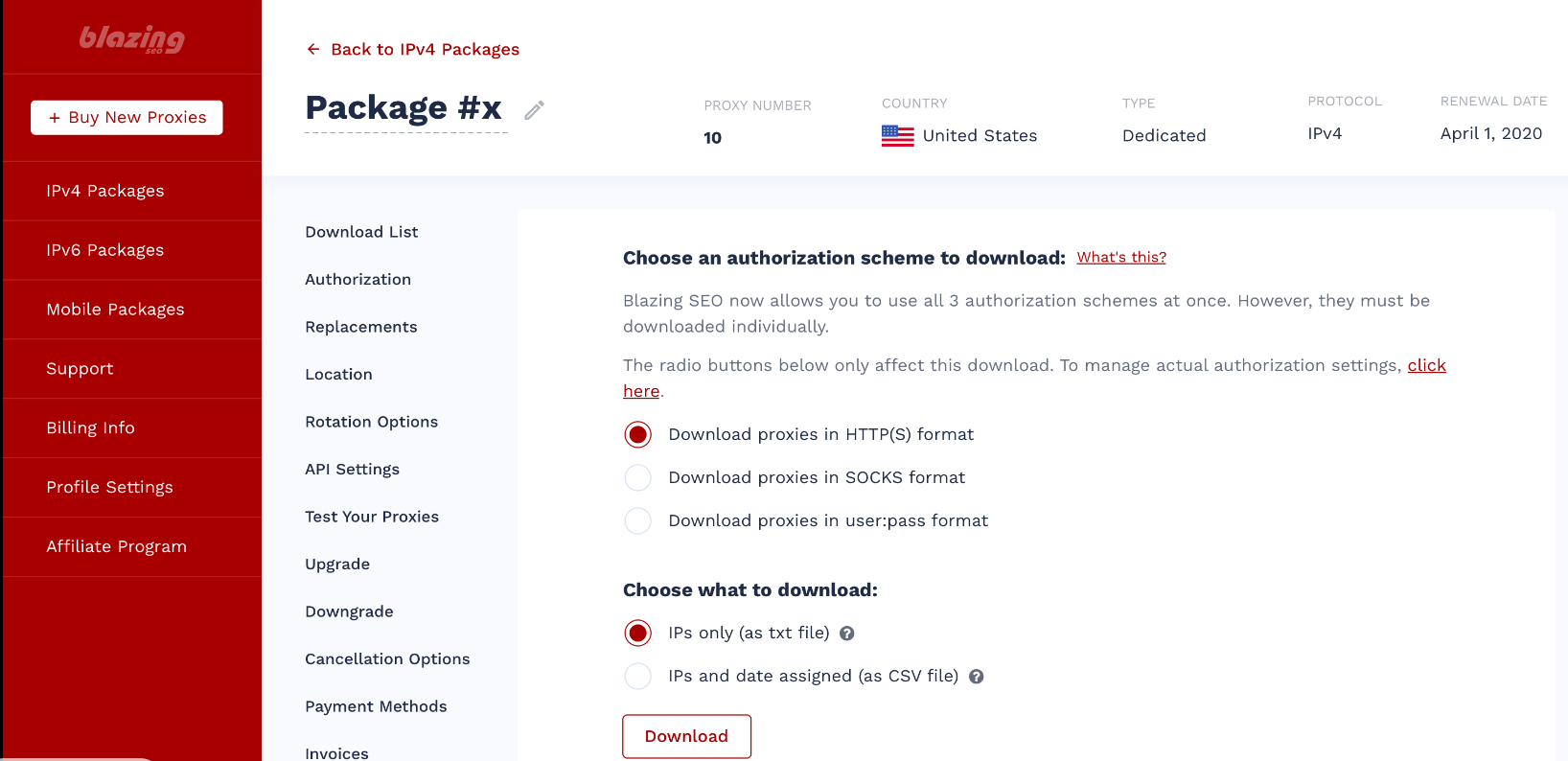
That’s why we now have separate management pages for IPv6 and mobile proxy packages. Yes, that’s right: you can finally download and manage IPv6 proxies from the proxy dashboard, although some functionality – like authorization – must still be completed through the means described here.
As for mobile proxies, well, keep an eye on your inboxes – because those will be moving out of beta soon!
Scrape at Scale With Chromium Stealth Browser
Self-hosted, Linux-first, compatible with all automation frameworks.

Coming Later This Year
We feel that this dashboard update will greatly improve the experience of using our proxies, and we certainly hope you agree. But we’re far from done. Though this addresses a few of the most glaring issues, we don’t just want to make something good – we want to make the best interface possible for all of our users.
To that end, we will be releasing a full redesign of our proxy dashboard before the end of the year. This redesign is designed to make things easier for first-time proxy users while providing more functionality to our longtime customers.
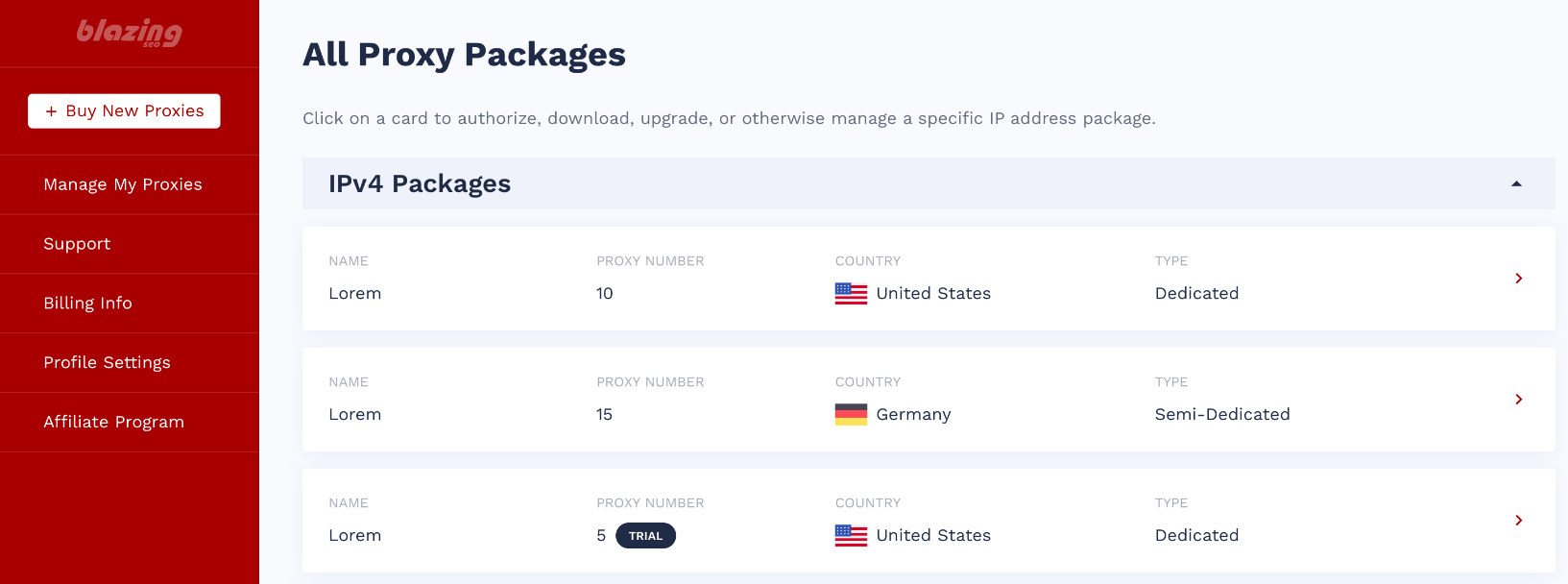
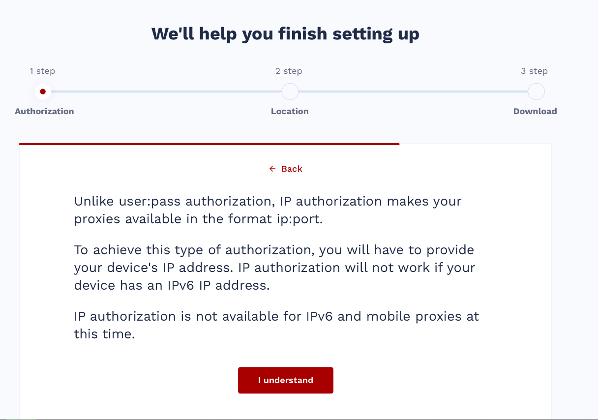
We’re still in the design stage of this project, but we’re already excited about what’s in store, from helpful user tutorials to individual package management to just getting a nice splash of color onto the user experience. Here’s a sneak peek of what we’ll be launching later this year (please note: designs are not final.)


Until then, if you have any comments or suggestions for our dashboard, please don’t hesitate to get in touch!


